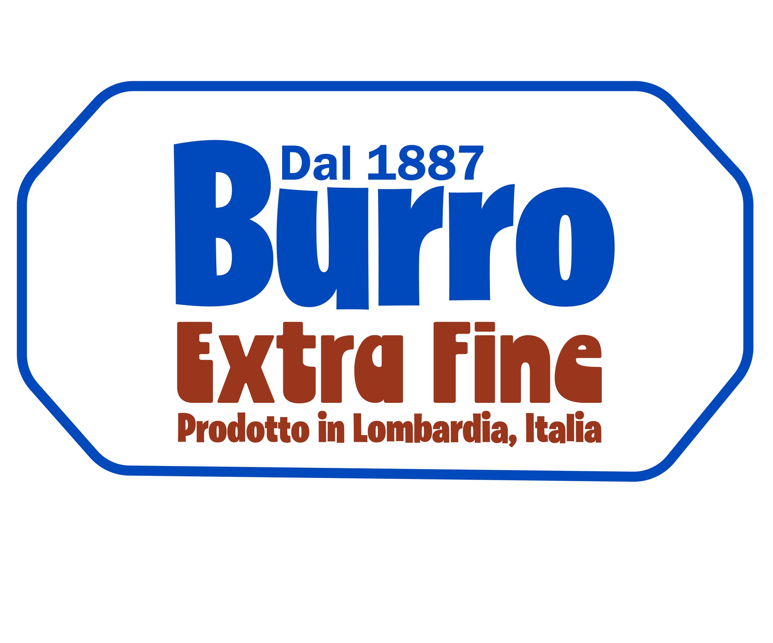
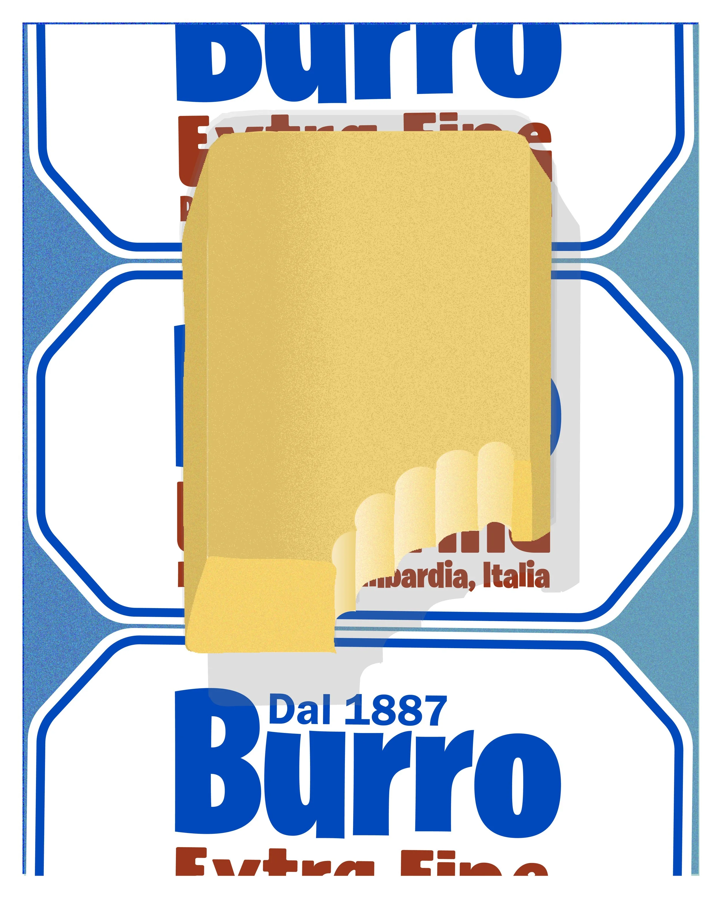
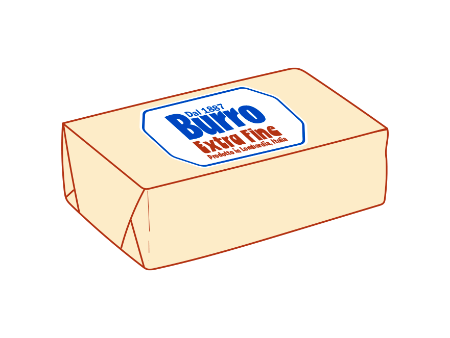
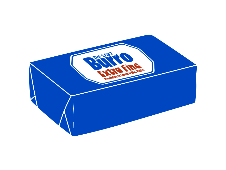
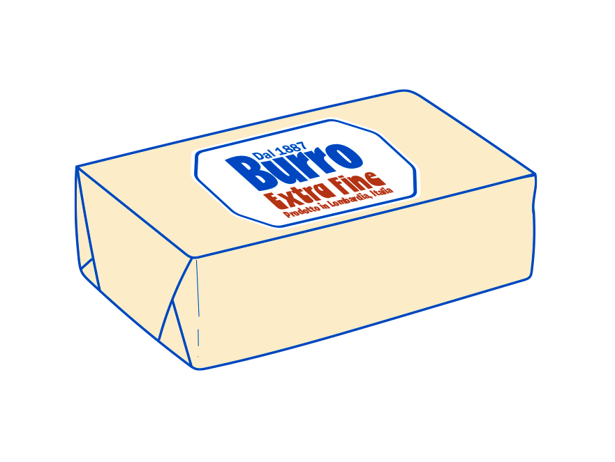
I designed a butter packaging that blends a timeless, old-school charm with a modern twist, bringing a fresh and updated aesthetic to the classic product. Drawing inspiration from vintage designs, I incorporated elegant but more up-to-date typography and soft, nostalgic colors while introducing contemporary elements like clean lines and minimal overall feeling. The result is a refined yet approachable look that feels both familiar and innovative, appealing to those who appreciate tradition but crave a modern touch in their everyday products.
bURRO EXTRA FINEPACKAGING ♡︎
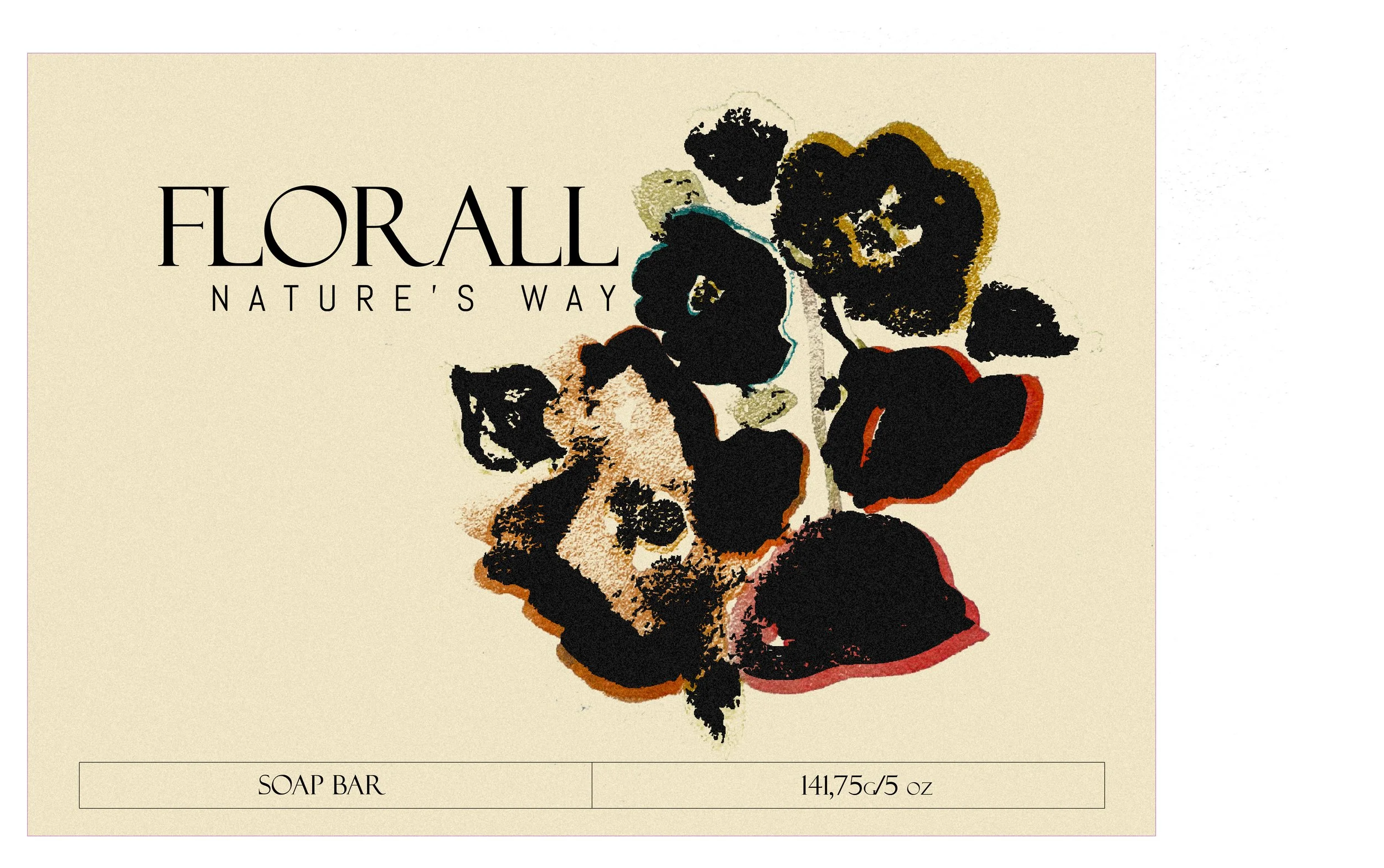
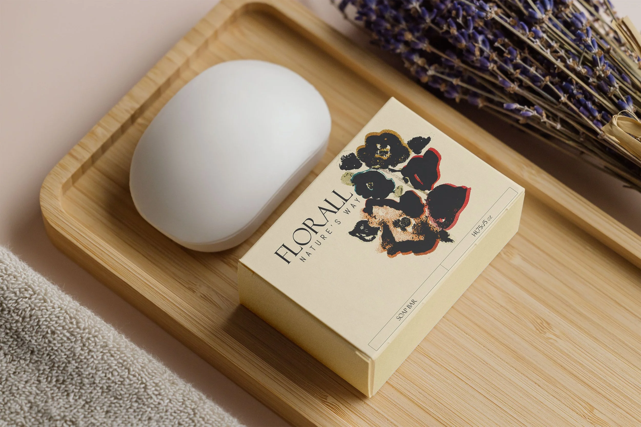
For the soap bar packaging, I crafted a design that reflects the gentle and delicate nature of the product while maintaining a clean, modern aesthetic. Using watercolors, I hand-painted the design to evoke a sense of softness and care, with subtle brush strokes that give it a personal, handcrafted feel. The gentle, flowing colors combine with a minimalist layout to create a calming and refined look. This approach ensures the packaging feels as soothing and sensitive as the soap itself, offering a serene and thoughtful experience from the moment you lay eyes on it.
FLORALL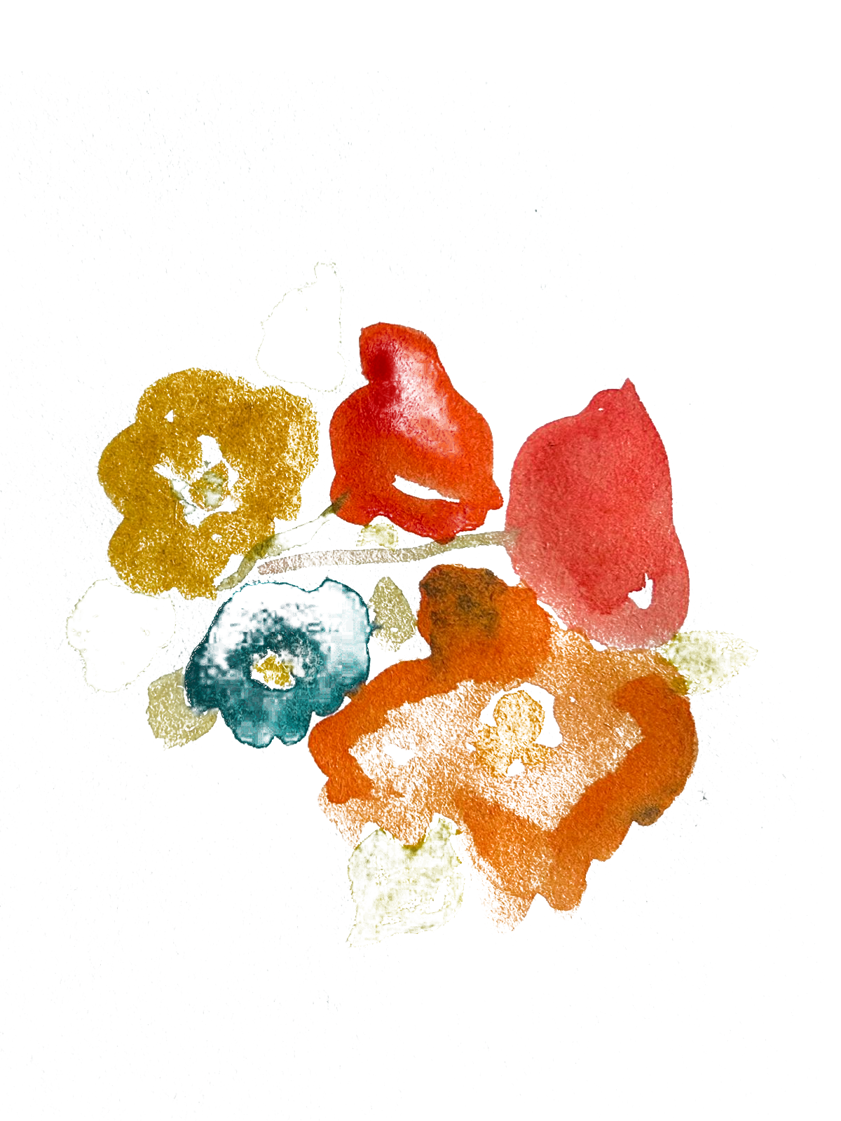
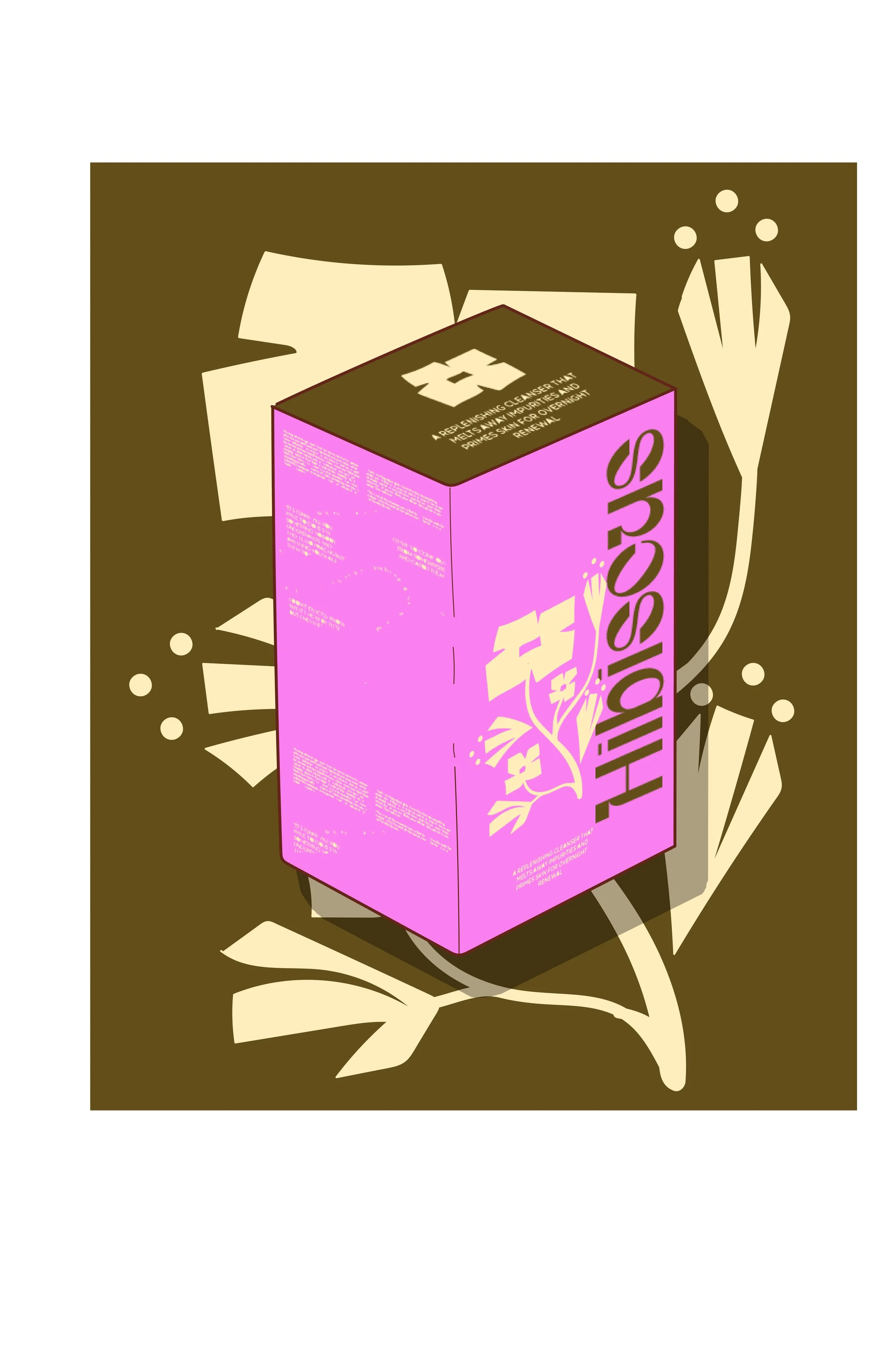
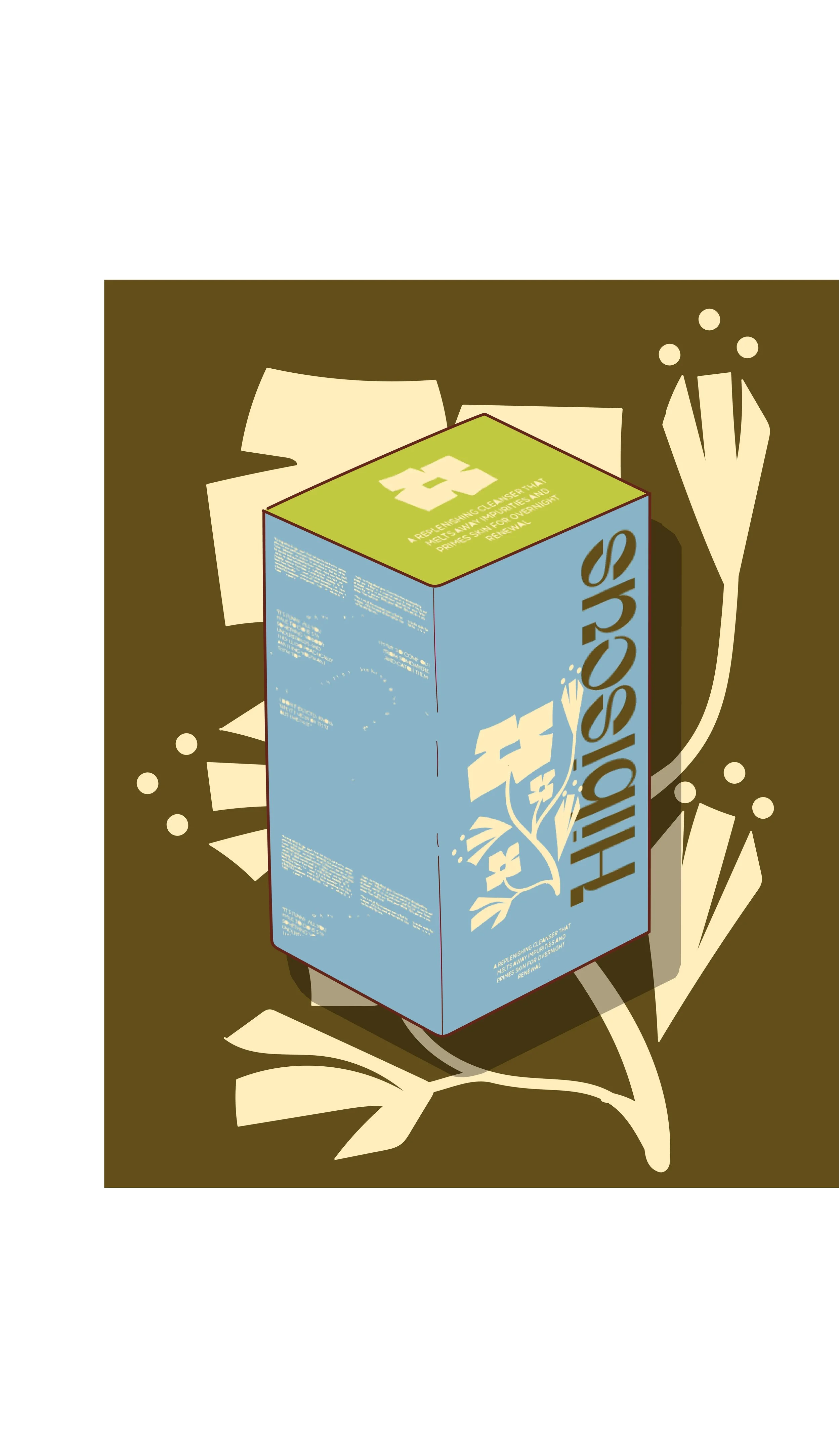
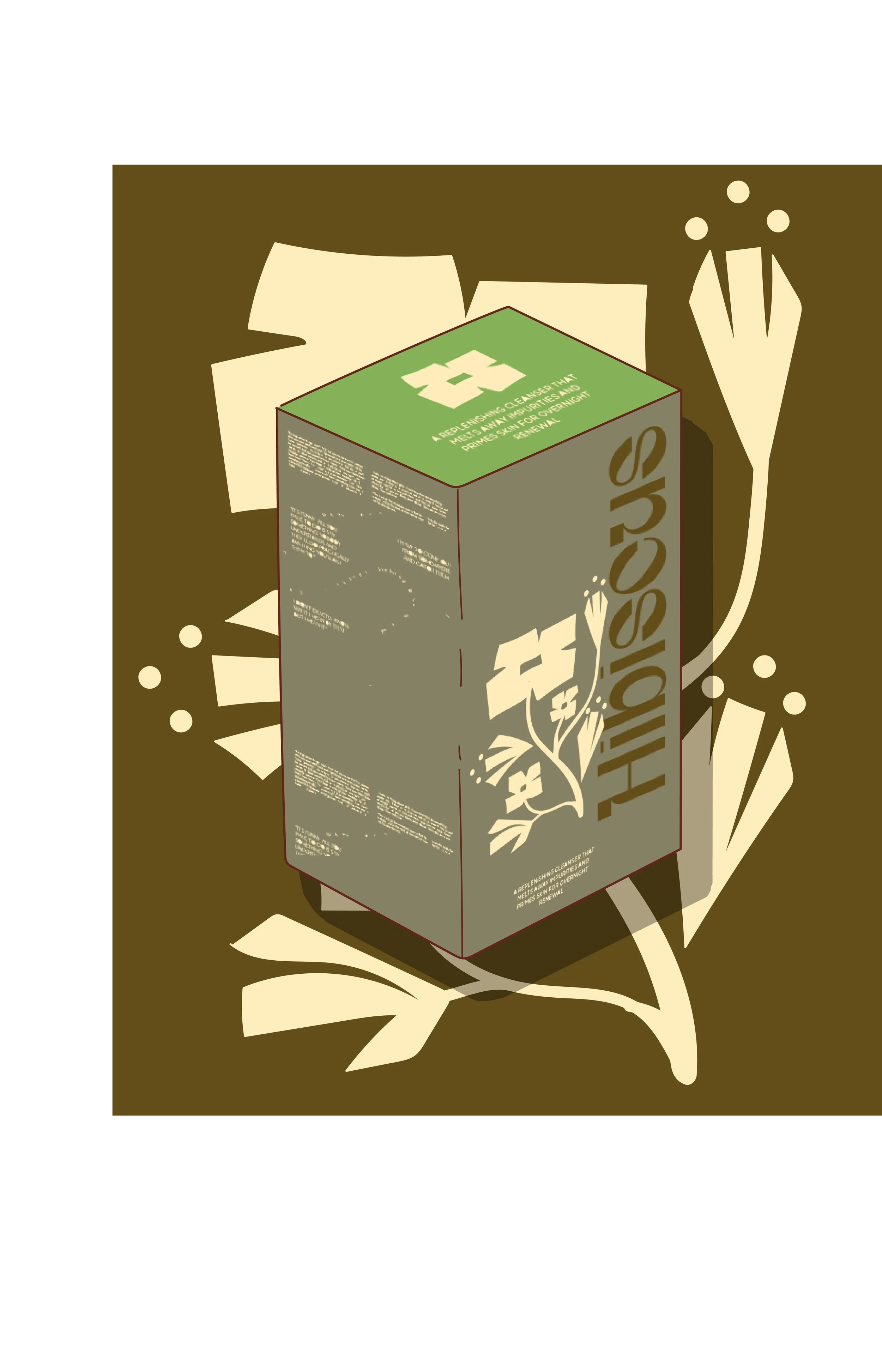
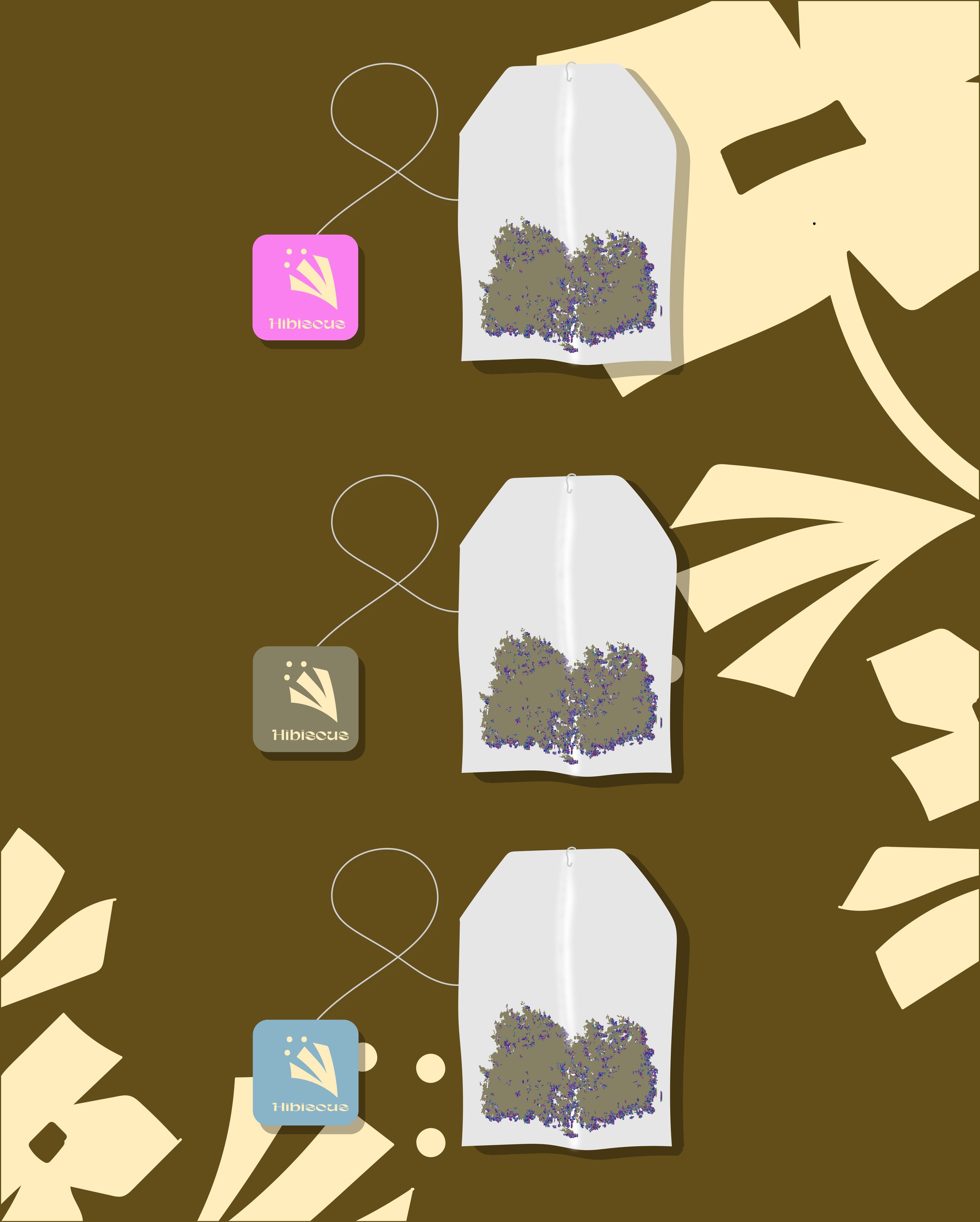
For the tea packaging, I created a vibrant yet calming design that reflects the natural botanicals inside. Using a floral aesthetic, I incorporated colorful elements that evoke the freshness and variety of the ingredients. The design strikes a balance between tranquility and energy, infusing the packaging with a spark of liveliness to contrast the typically low-energy vibe of such products. This lively burst of color and floral details brings an uplifting feel, while still maintaining a soothing overall look, capturing perfectly the balance of relaxation and invigoration that the tea offers.
HIBISCUS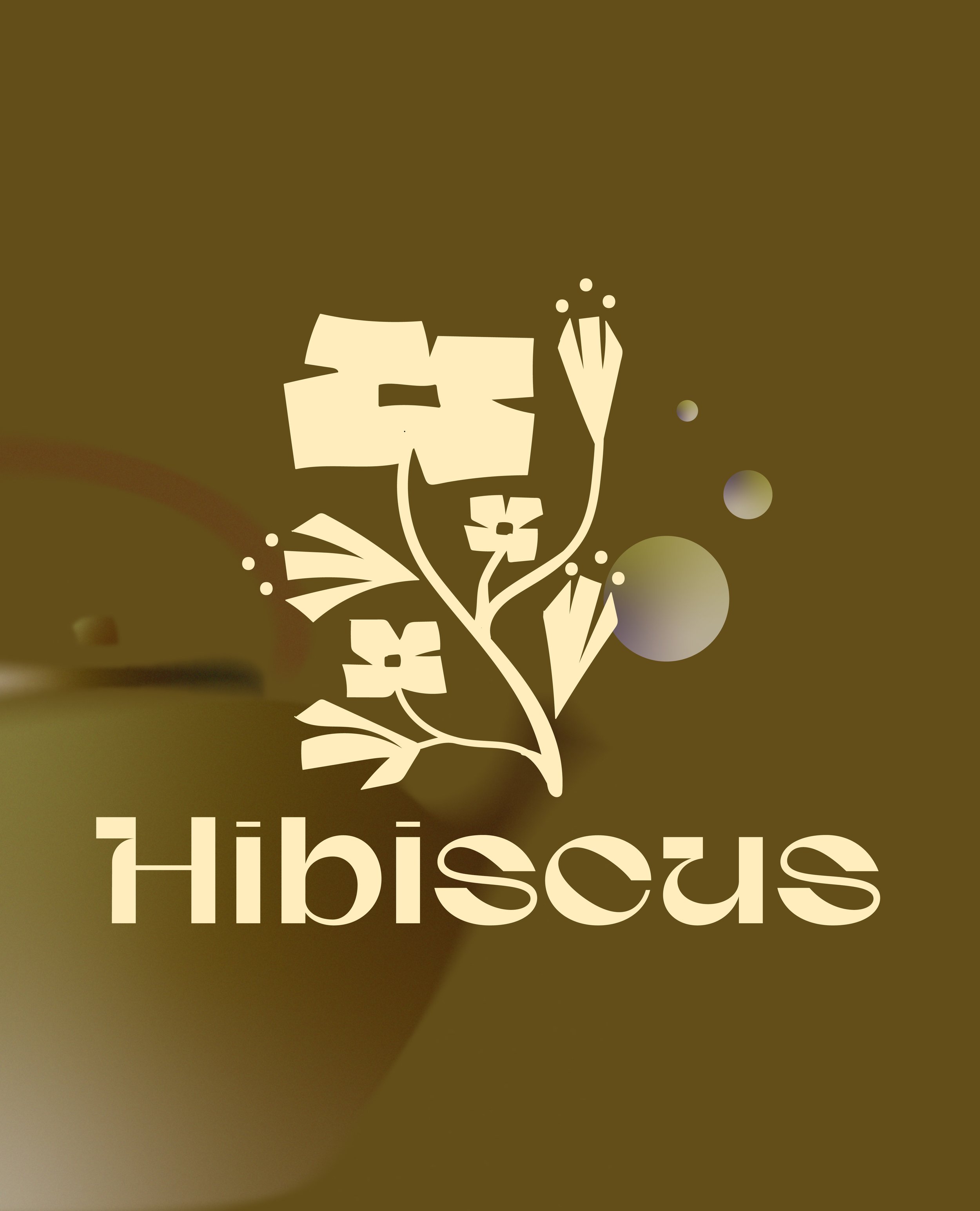
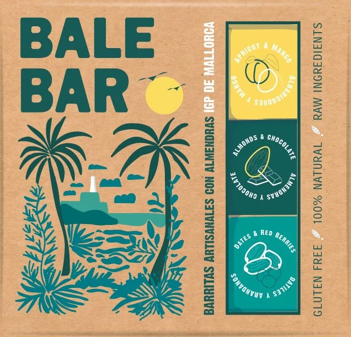
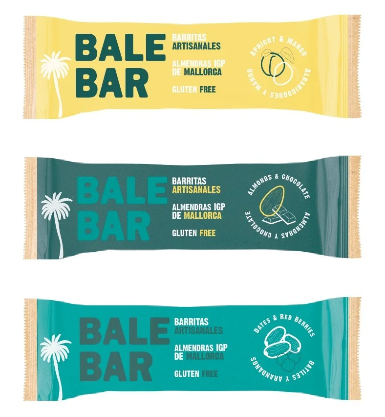
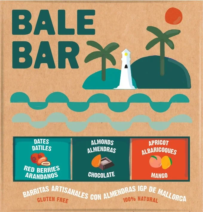
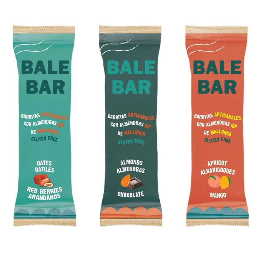
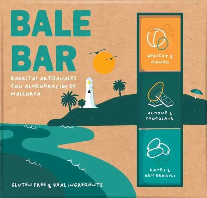
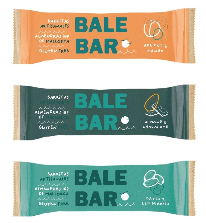
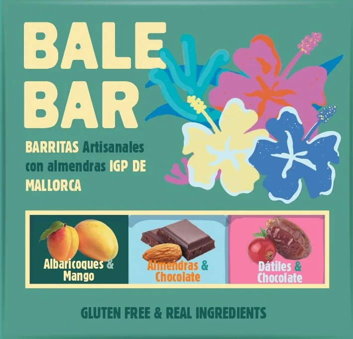
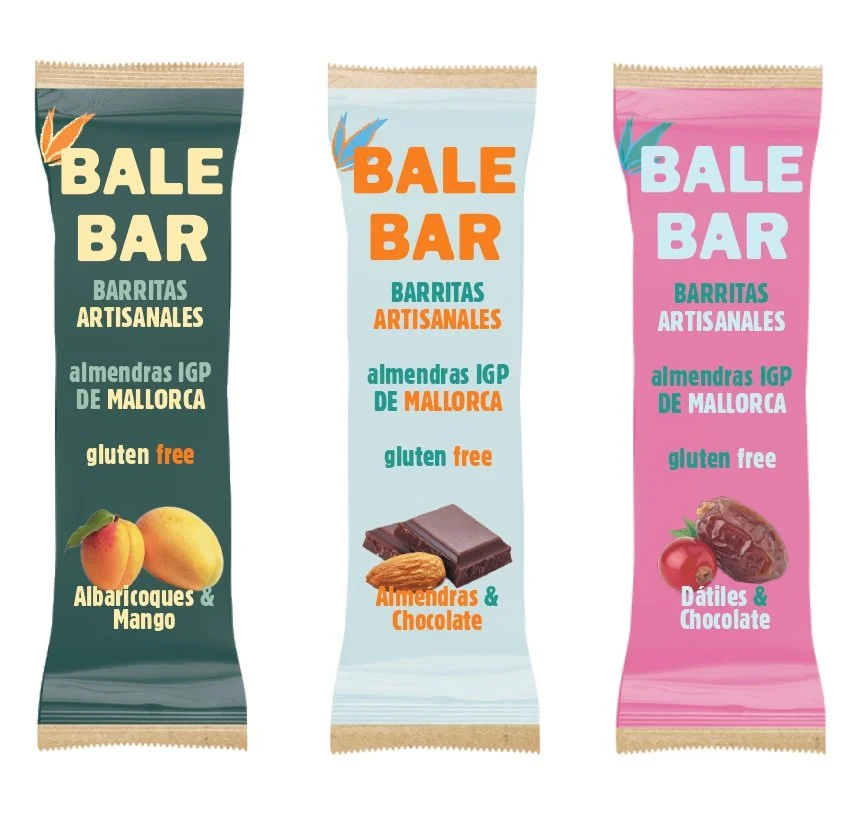
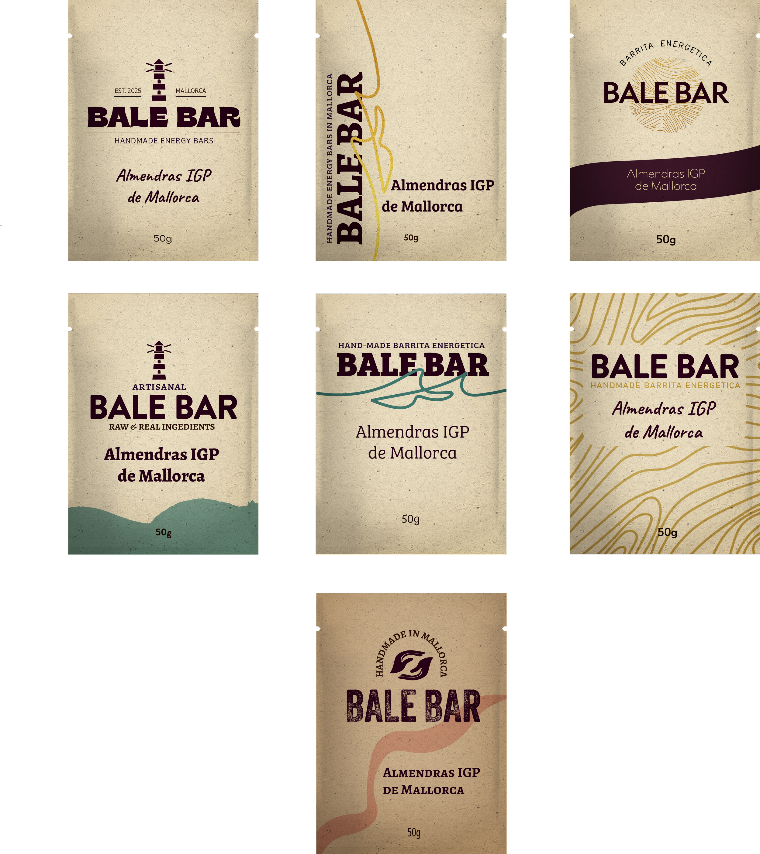
For the energy bar packaging, I collaborated with a brand from Mallorca to create a design that truly reflects their artisanal and healthy approach. The packaging is energetic, clean, and honest—focused on the product itself without any unnecessary embellishments to try to convince you to buy it. We kept the design minimal, letting the quality and authenticity of the bars shine through. Inspired by the vibrant identity of Mallorca, the packaging incorporates vivid elements of the sea, summer, and the island's natural beauty. The bold colors and refreshing imagery capture the essence of Mallorca’s energy, offering a true sense of place that’s both invigorating and grounded in authenticity.
balebar